A customer should not have to read tiny text, hear a video or recognise an emoji to understand your offer. Small changes to your posts can help more people get the information they need, including people with sight loss, hearing loss, dyslexia or a cognitive disability, and anyone scrolling with the sound off.
This guide covers post copy, alt text, video captions, graphics, contrast and emoji use, with examples you can adapt for your business. Build these checks into your normal planning and approval process.
In short
- Put the important information in the post text, not only in the image.
- Add alt text that explains what the image shows and why it matters.
- Check video captions word by word before you publish.
- Test graphics at phone size and check the colour contrast.
- Use CamelCase hashtags and keep emojis to a few.
Write post captions that are easy to follow
The caption beneath a social post is different from the captions that show a video’s audio. Both matter. For post copy, use familiar words, short paragraphs and a clear next step. Explain unfamiliar abbreviations and put important information in the text, even if it also appears on a graphic.
EXCLUSIVE OPPORTUNITY!!! DM ASAP TO SECURE YOUR COMPLIMENTARY INITIAL CONSULTATION.
Book a free 20-minute consultation. We’ll discuss your goals and explain your options. Send us a message to choose a time.
Capitals, jargon and stacked exclamation marks are harder to read, and some screen readers spell out capitals letter by letter.
Use descriptive link wording where the platform allows it: “View the café menu” is more useful than “Click here”. Avoid copying decorative Unicode lettering into captions to imitate bold or script fonts, because screen readers may read each character as a symbol or skip it entirely. The Scottish Government’s social media accessibility standards offer useful principles for clear copy and graphics.
Add alt text that explains the image’s purpose
Alt text is a text alternative for an image. It helps people using screen readers understand information they may not see. Add it through the platform’s image accessibility settings where available, and check any automatically generated description.
Describe what matters to this particular post. Include important words shown only in the image, and avoid keyword stuffing or guessing someone’s identity. For charts or complex diagrams, put the main findings and supporting information in accessible post or webpage text too. W3C’s alt-text decision tree explains how purpose and context affect the description.
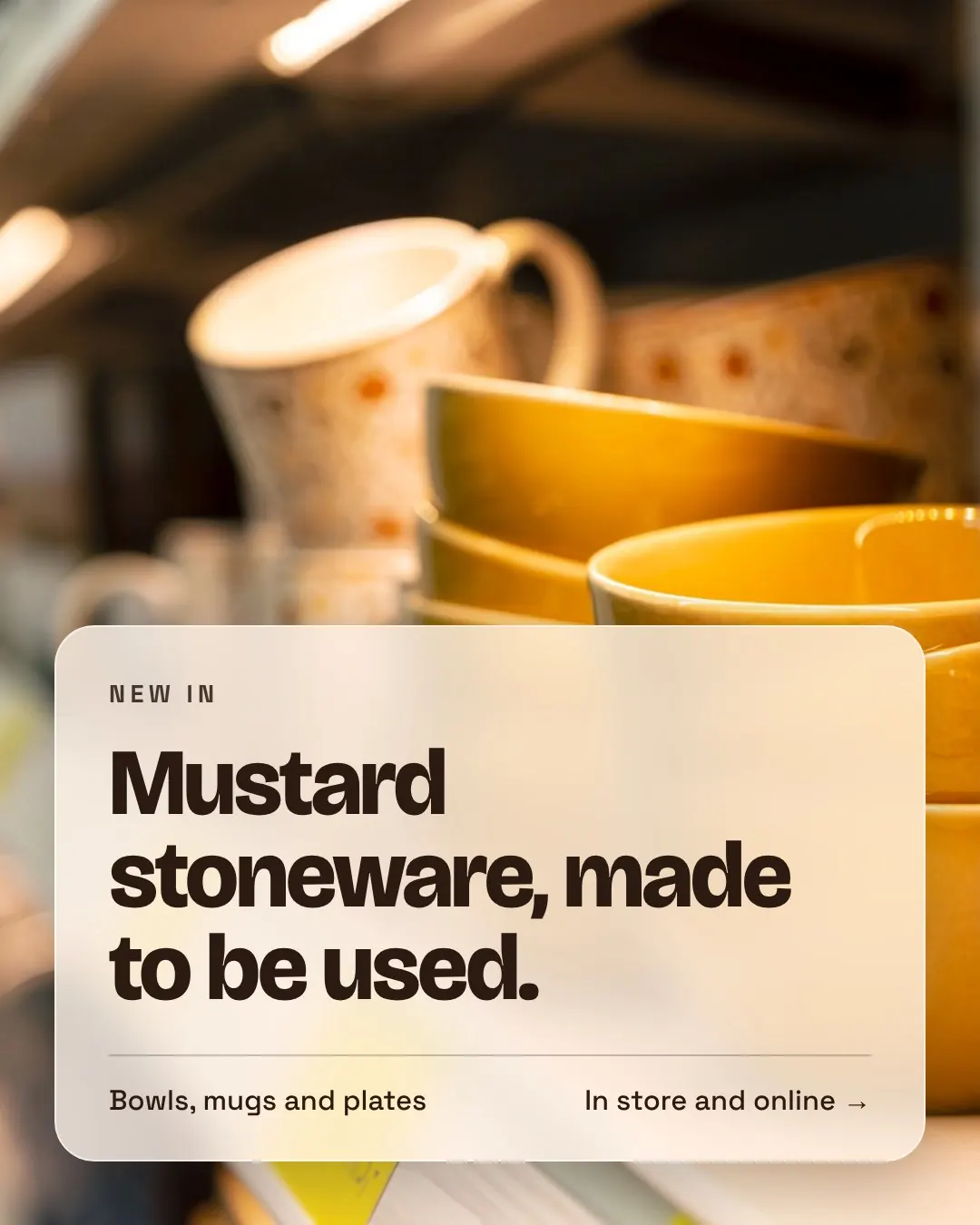
Useful alt text for this post
Social graphic of stacked mustard yellow stoneware bowls on a shop shelf. Text reads: New in. Mustard stoneware, made to be used. Bowls, mugs and plates. In store and online.
Not useful: “Image of products.” It says nothing about what is for sale, and the words on the graphic are lost.
For an offer graphic, make the offer available in the post caption as well: “Two houseplants for £12. Offer ends Sunday. Available in store.” Alt text should add useful image context without needlessly repeating the whole caption. If the platform or scheduling tool does not support the description you need, include an image description in the post and link to an accessible page for fuller information.
Where to add alt text on each platform
| Platform | Where to find it |
|---|---|
| Before you share, open the advanced or accessibility settings and choose to write alt text. You can also add it to a published post by editing it. | |
| Edit the photo in your post and look for the alternative text option, then replace the automatic description. | |
| After adding an image, select the alt text option on the image before posting. | |
| X | Select the image’s Alt or description option before you post. |
| Scheduling tools | Most tools have an alt text field on each image. Check it carries through to every platform you publish to. |
Caption videos and check the finished version
Video captions should communicate the speech and meaningful sounds, not just a few highlighted words. Review automatic captions before publishing: names, prices and place names are easy to get wrong. Identify speakers where needed and include relevant sounds, such as “[doorbell rings]”, when they help explain what is happening.
The repair costs £15.
One misheard word changes the price. Always read the captions against the audio before you post.
Use readable text, strong contrast and enough time to read each caption. Check that platform buttons and other text do not cover it, as the lower part of the screen is often hidden by the caption, username and buttons. If you embed captions into the video, check whether a second automatic caption track creates an overlapping duplicate. Where supported, accurate selectable captions let viewers turn them on or off. See W3C’s guidance on captions and subtitles.
Also consider viewers who cannot see the action. During a demonstration, explain the important visual steps aloud: “Turn the dial clockwise to the 180-degree mark” is clearer than “Turn it like this”. Plan for description of visual information from the start; captions alone do not provide that information. A transcript is a useful additional option for longer videos.
Make graphics readable on a phone
Keep each graphic focused on one main message. Use clear lettering, generous spacing and a simple layout. Avoid putting a full menu or a page of terms into a single small image. Share the detail as normal text or on an accessible webpage.
Check the exported graphic at the size people will actually see in their feed. Text that looks large in a design editor may become tiny on a phone. For carousels, use a consistent reading order and make each slide understandable on its own.
Example: A salon graphic can say “Late appointments on Thursdays”. Put booking details, times and any conditions in the accompanying caption.
Our guide to custom social media graphics can help you plan a consistent style. Readability should be part of that style from the start.
Check colour contrast, not just your brand palette
Use a contrast checker to compare text with its background. As a practical benchmark, WCAG’s Level AA minimum text contrast is 4.5:1 for ordinary text and 3:1 for large text. Large text has a defined size: at least 18 point, or 14 point bold, at its delivered size. Social graphics are often scaled down, so aiming for 4.5:1 throughout is a useful default.
Our own brand pink with white text is 4.0:1, so we use it for large headings and a deeper pink for smaller text. Check your brand colours the same way.
These ratios are a starting point, not a complete accessibility check. Thin fonts, busy photographs and small text can still be difficult to read. Place text on a solid panel when a photo background makes contrast unpredictable.
Do not use colour alone to communicate a difference. Instead of “Choose the green option”, label the options “Available” and “Sold out”.
Use hashtags and emojis sparingly
Capitalise the start of each word in a hashtag, such as #SmallBusinessSaturday, to make the words easier to distinguish and to help screen readers pronounce them. Keep hashtags relevant and place them after the main message when practical.
Screen readers announce emoji names. Repeated icons or emoji between every word can make a simple sentence lengthy to hear. Use a small number to add tone, not to replace essential words, instructions or list bullets. Check their meaning in context. The Government Communication Service accessibility guidance covers hashtags and emoji use.
We ❤️ our 🐶 customers! Book ✂️ now!
A screen reader may say: “We red heart our dog face customers! Book scissors now!”
We love meeting your dogs. Book a grooming appointment for next week. 🐶
A screen reader may say: “We love meeting your dogs. Book a grooming appointment for next week. Dog face.”
A quick check before you publish
- Can someone understand the offer and next step from the post text?
- Does each meaningful image have a useful text alternative?
- Have you checked video captions for accuracy, timing and placement?
- Is important visual information explained in the audio or an appropriate alternative?
- Is the graphic readable at phone size, with checked contrast?
- Does the message work without relying on colour or emojis?
- Have you previewed the finished post on its destination platform?
Ask for feedback and improve templates as you learn. These checks can reduce common barriers, but they do not guarantee that every post works for every person. Platform features and individual needs vary.
Accessible social media FAQs
What is accessible social media content?
It is content that more people can read, hear and understand, including people who use screen readers, watch with the sound off or find small or low contrast text hard to read. In practice that means clear copy, alt text, accurate captions, readable graphics and sensible emoji use.
How long should alt text be?
Usually a sentence or two. Describe what matters for the post and include any words shown in the image. If an image needs a long explanation, such as a chart, put the detail in the caption or on a webpage.
Are automatic captions good enough?
They are a useful starting point, but they often get names, prices and place names wrong. Read them against the audio and correct them before you publish.
How many emojis are too many?
There is no fixed rule, but a few is plenty. The Government Communication Service suggests no more than three per post. Never use emojis in place of words that carry the meaning.
For more practical planning advice, explore our social media tips for small businesses. If you would like help creating clear, consistent content for your business, talk to the 99social team.